Role
UX/UI Design
Project Coordinator
Development
Tools
Adobe XD
ClickUp
Photoshop
Shopify
Team
1 Brand Designer
1 Developer
1 Copywriter
Timeline
8 Weeks
The Problem
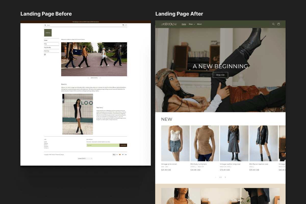
Hedoum's website didn't align with the quality of its products or its social media branding. Analytics showed they also had a high bounce rate, which can be attributed to the inconsistent design of the website.
-14%
Decreased in bounce rate
+28%
Increase in conversion rate
Research
I first looked at Shopify's analytics to see if there were any underlying problems that can help with the redesign. Next, I created a survey, receiving 22 respondents and interviewing 4, to get a better understanding of their experience with the e-commerce space and the current website.
Findings

Using Shopify's analytics, we found a high bounce rate of 87.8% between desktop and mobile.

90.9% of survey participants buy online and thrift at specific stores; when asked why 100% of the answers revolved around trusting that store's products and services.

Online thrift shoppers need various details such as brand, material, condition, and appearance when making a purchase.
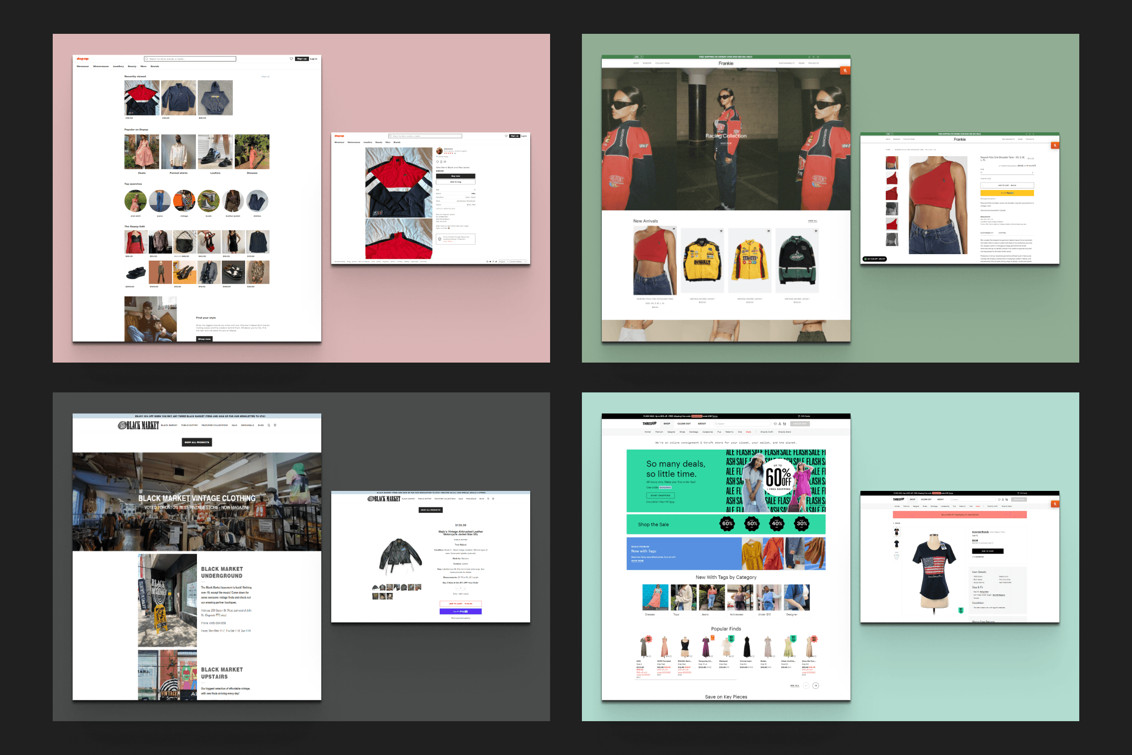
Competitive Analysis
Based on Shopify's data, 64.9% of customers are based in Canada and the US. I looked at competitive sites within these countries to get inspiration. I found:
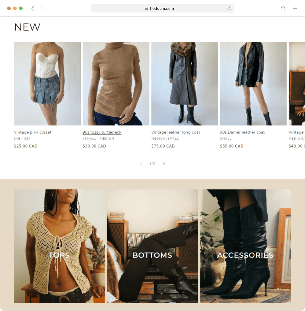
Product cards and categories are used to quickly showcase products right from the home page.
Some type of value proposition or testimonial is utilized on the homepage to showoff uniqueness and build trust.
Product pages had consistent listing layouts and information, helping with exploratory as I was able to expect what information will be on the page.
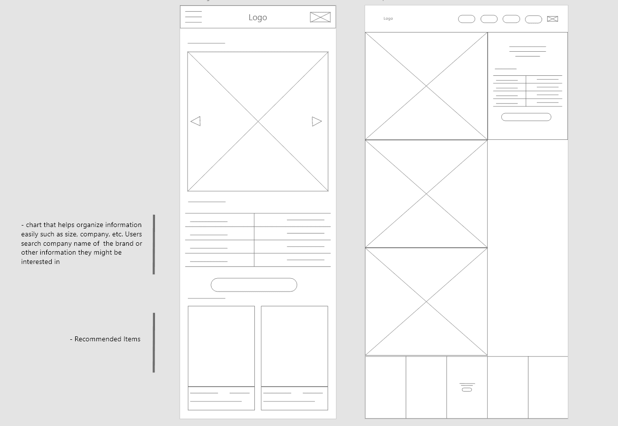
Ideation
Below are mid fidelity designs of mobile and desktop, with design information the influenced the design decisions.
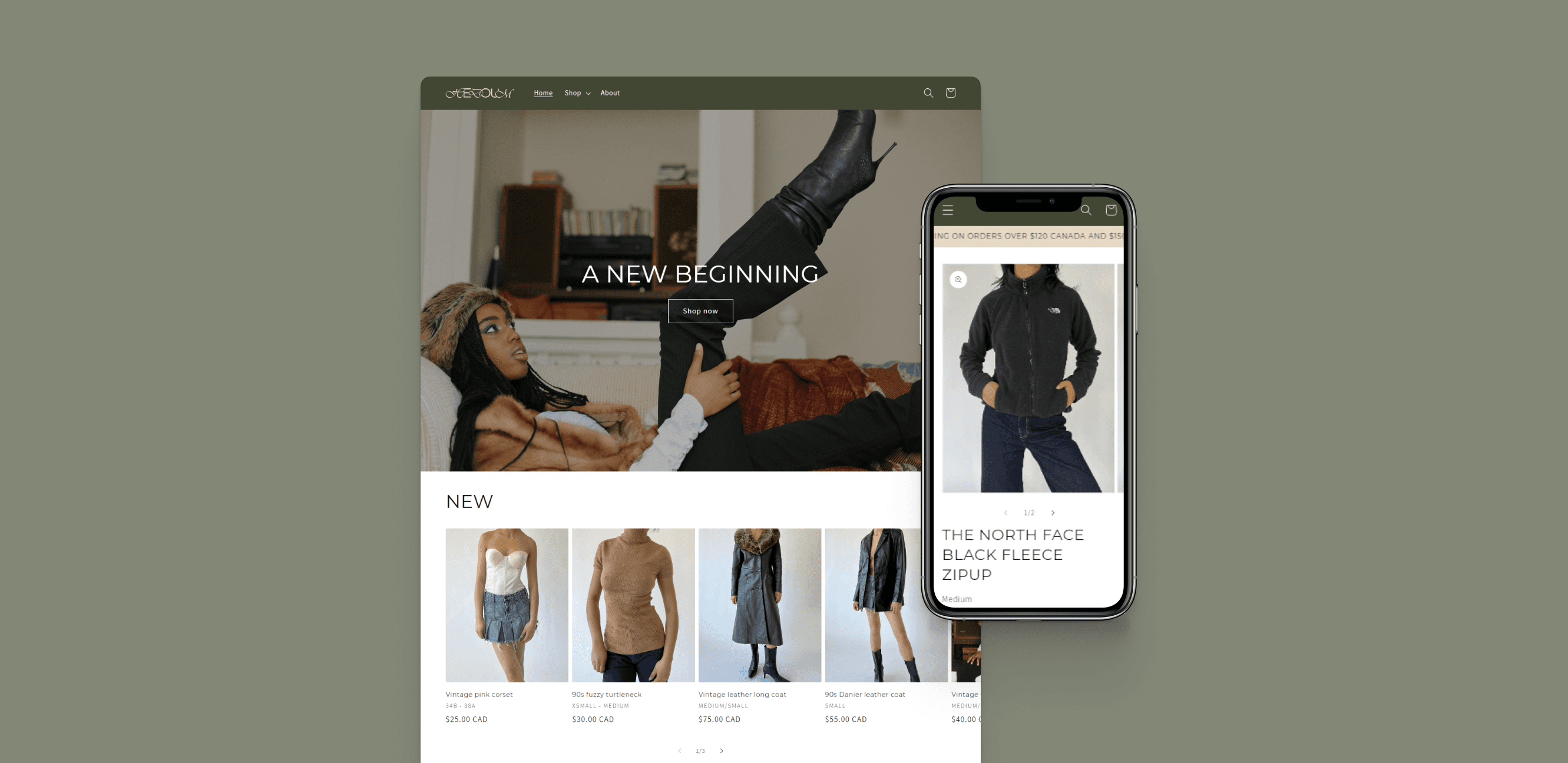
Home page
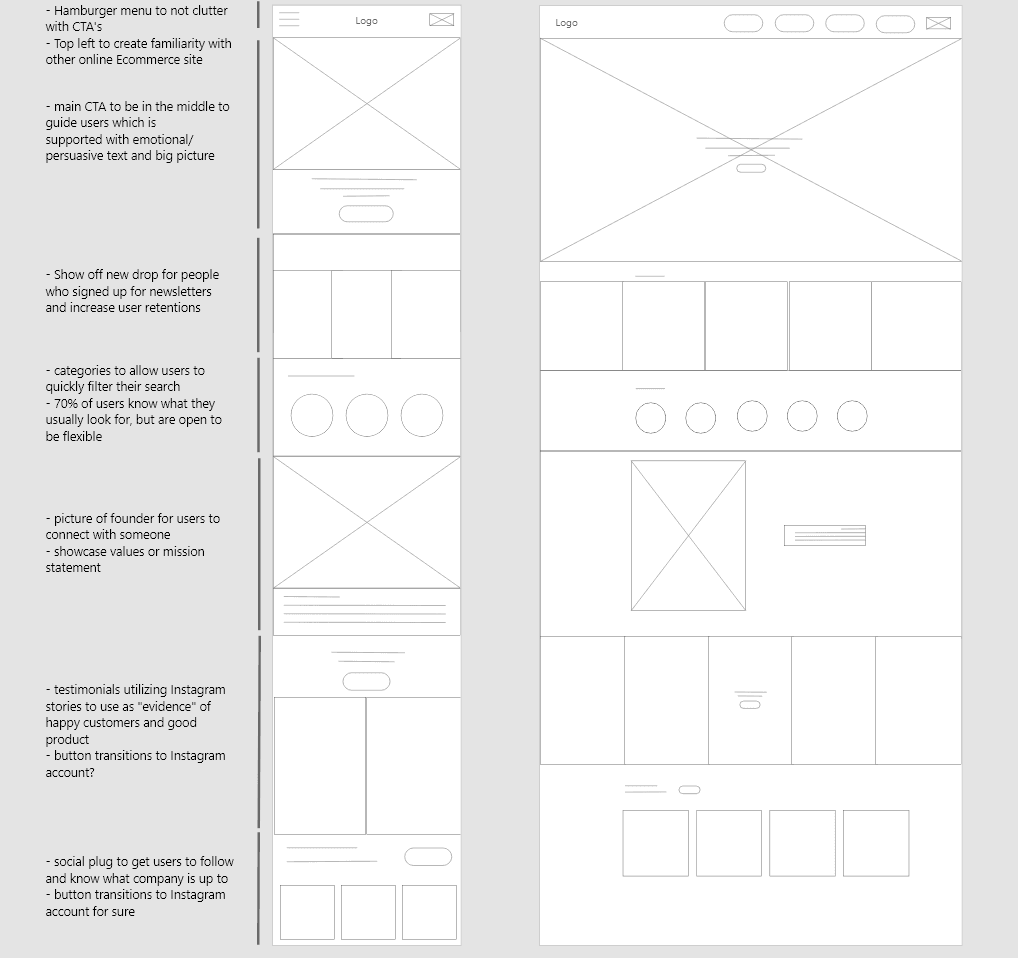
Product page
Testings
I facilitated 5 moderated usability testing through online video chat platforms the user was comfortable with using. These were the results:
5
Respondants
5
Questions
2
Day's time
participants were able to quickly tell it was a thrift/clothing store and navigate the site, even finding products they wanted to buy
when describing the product or website, they used words such as "high quality" and "trustworthy"
most importantly, users were quickly enticed by the products and categories on the homepage
Final Designs
Decreasing the bounce rate
Using common design trends for the navigation allowed the users to navigate a new website efficiently. With the addition of products and categories on the homepage, users were quickly enticed to explore the products Hedoum offered.
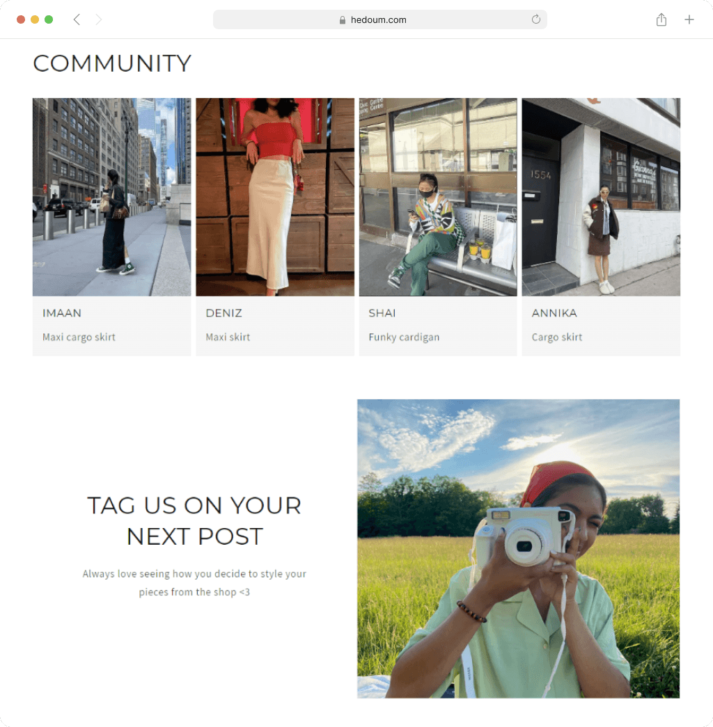
Social proof
We incorporated a unique social proof that utilizes Heodoum's Instagram story as it showed previous customers with past products. This was used as a testimonial as we currently had no customer reviews to work with.
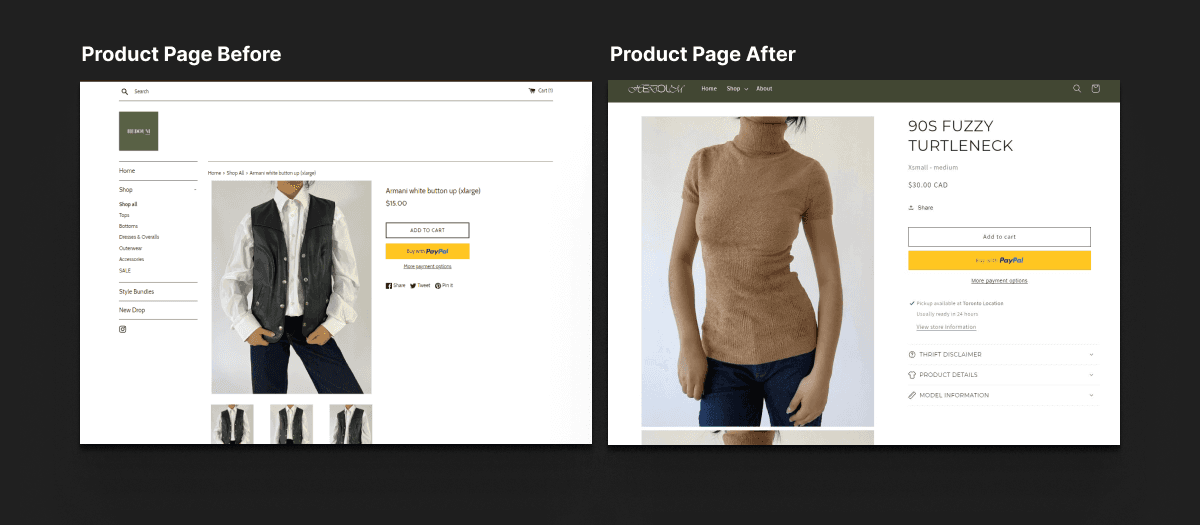
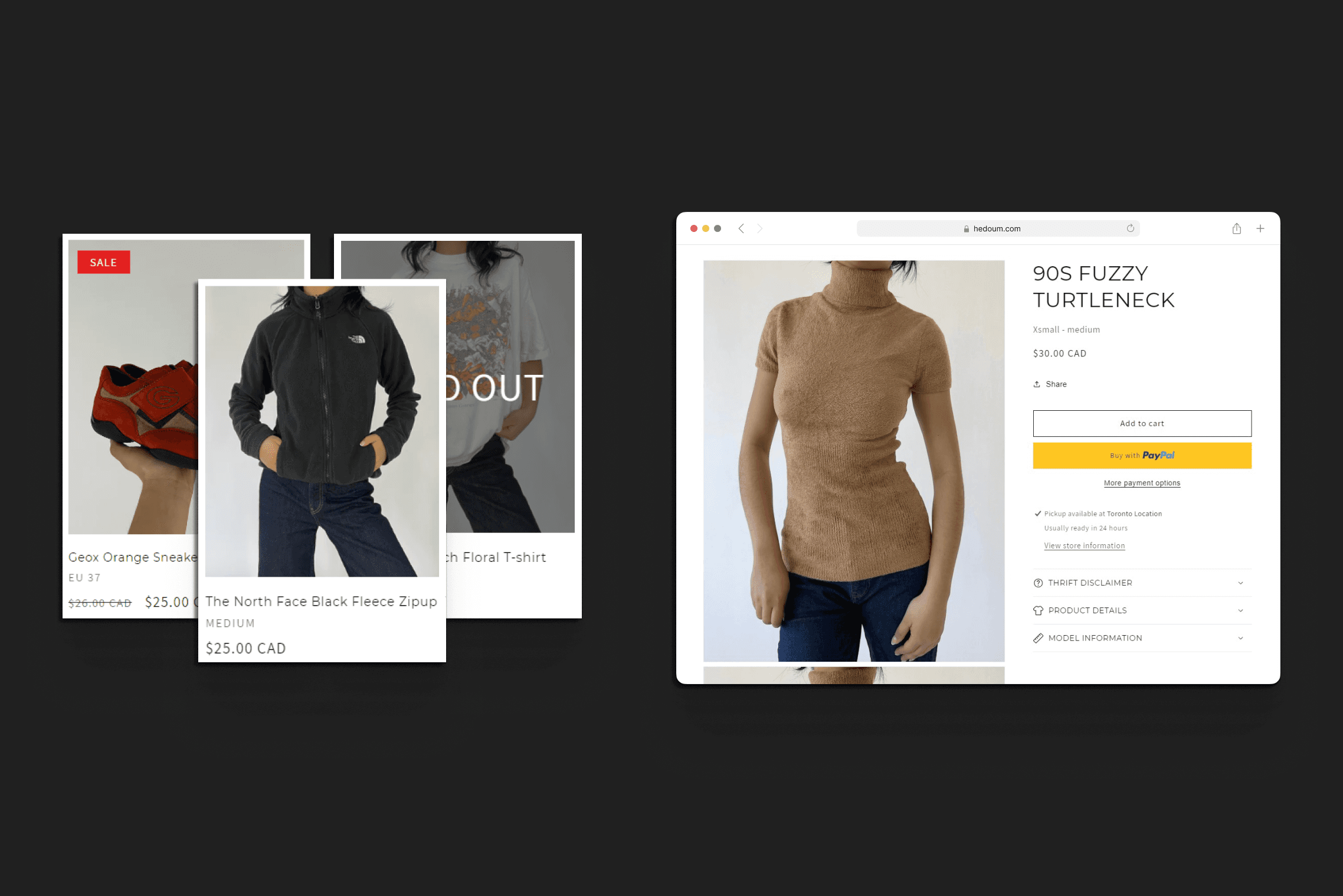
Clear, accessible product information
We improved the organization and clarity of product details by renaming and reorganizing product cards on the home and catalog pages. Using tabs and charts on the main product page further enhanced the user experience. Standardizing the information format also enabled the client to easily upload future products.
Development
Due to unfortunate circumstances, our developer had to leave the project. At that time, we needed to finish developing the product page. Using previous coding knowledge and experience, I was able to learn the basics of Shopify's custom code and take on the challenge.
Metafields
Previously, the client manually updated the product's information through one giant description box. This provided no organization or design capabilities and made it difficult to remember what information to add to the product. Using metafields, allows the client to fill out a form that automatically updates the product page information. This helps standardized the product uploading process and have an aesthetic design.
Prototype
Next Step
If I were given time or another chance to work on this project in the future, these are the future plans I would like to explore:
Use a modal to improve subscription rates and retention
Incorporation of a user account to create new features such as wishlists/favorites and improve checkout efficieny by saving key information
Improve purchase experience of mystery boxes
Reflection
Really proud of my work for being able to handle the coordination, design, and development of this project. I was really able to utilize past experiences to break down complex problems and come up with solutions on the go, especially when coding. I was happy to have worked with other people such as developers and copywriters, and not just other designers. Working on this project felt like I was running my own business and I wanted to look at all the different ways I can optimize any processes and improve my business overall.