Role
User Research
UI Design
Wireframing
UX Design
Tools
Figjam
Notion
Figma
Dovetail
Timeline
4 weeks
Team
3 Designers
The Problem
The MyPlace group's page was structured optimally, resulting in time wasted searching for information. There was also a lack of information for users to absorb to allow themselves to connect with others.
The Solution
Use of tabs to improve information architecture, and added features such as discussion and personality trait tags to allow users to engage with others and build relationships.
Research
Usability Review
Prior to diving deep into the given problem, we wanted to see the product for ourselves and make note of our experience.
Competitor Benchmarking
We then did a competitor benchmarking to see what other product’s group/community pages looked like to get a sense of what the standard was.
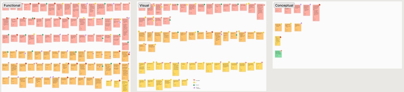
Affinity Mapping
We then went through all the little frustrating “post it” notes that we had and categorized based on three groups: functional, visual, and conceptual. On top of that, we discussed the severity of each ranking them from 0 to 9 (9 being the most severe). We also developed themes to be able to further group the frustration points.
Common Themes
Information/context
Organization
Problem Space
Who is affected?
New and returning MyPlace members
What is the problem?
User face difficulty in navigating between pages and are unclear in the purpose of the provided features & how to use them, in order to foster meaningful connections.
Where does this problem occur?
When users attempt utilizing group functions and browse between members’ profiles.
Why does the problem occur?
- unclear and disorganized language
- absence of labelling
- weak discoverability
- insufficient context
Why is this problem important?
Users will find themselves more focused on learning how to navigate the website rather than connecting with other members.
Research Goal
With the problem space inmind, we created and then established a research goal for us to tackle.
To understand how people interact with & within the community
This will allow us to get a deeper understanding of how users interact and behave, aiding us in our problem.
Interviews & Insights
Having done surveys and 1-on-1 interviews, we were able to dig deep and get insights of user behaviour.
Primary Insight
Secondary Insight
How Might We…
We then finally established a goal
How might we foster an interactive environment so that users engage with other group members and form connections?
Ideate
Mind Mapping
To further explore different ideas, we established a mind map of things that can be improved and things that can be added to enhance the group and connection experience.
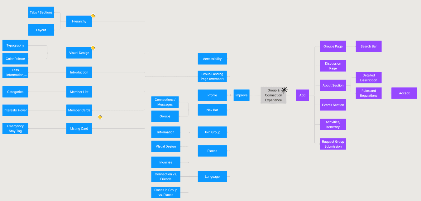
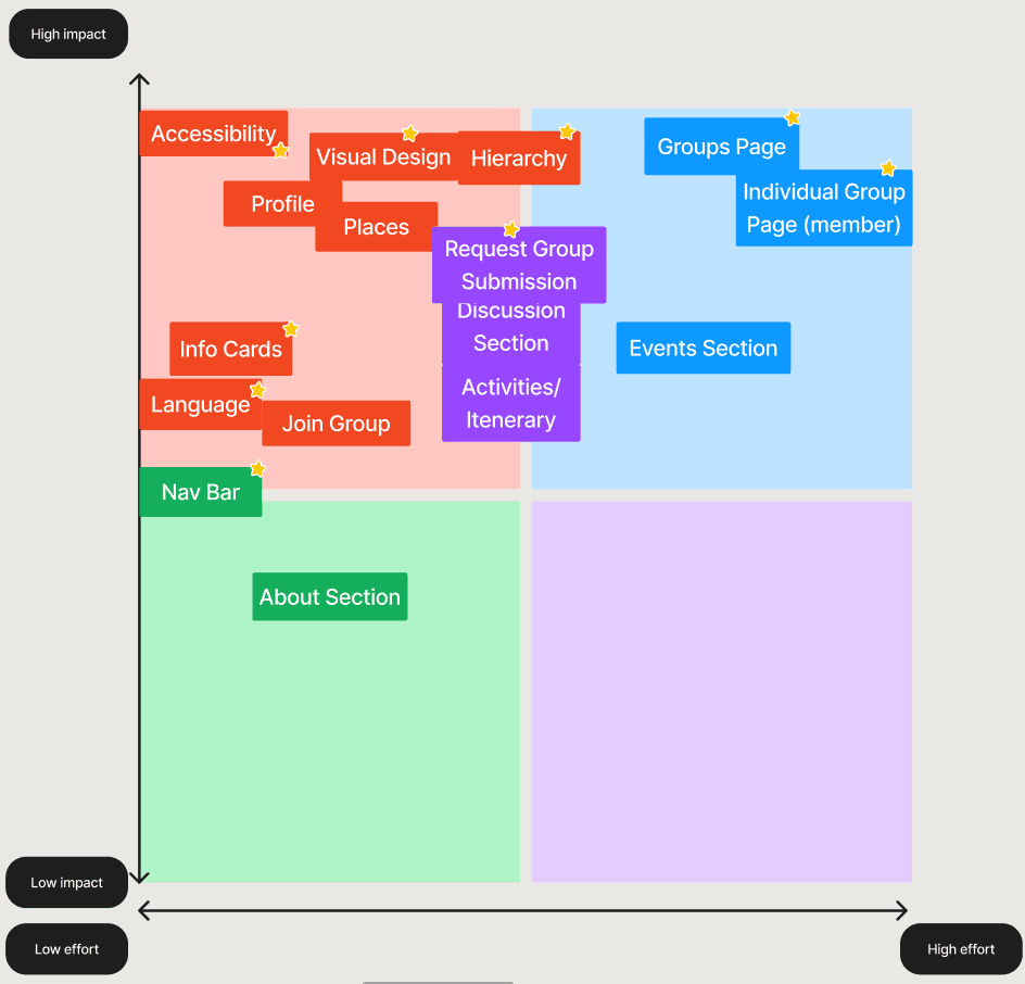
Following the mind map, we did a effort vs impact to prioritize the ideas that can make the biggest impact with minimal effort.
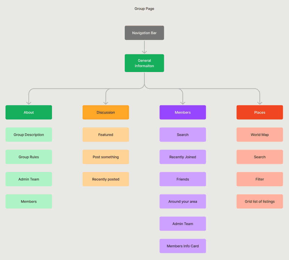
Information Architecture
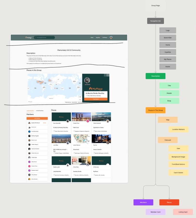
Tackling the initial problem space, we used information architecture to see where we can improve the content being displayed. We also used this opportunity to improve on components that would help establish a better engagement such as the members card.
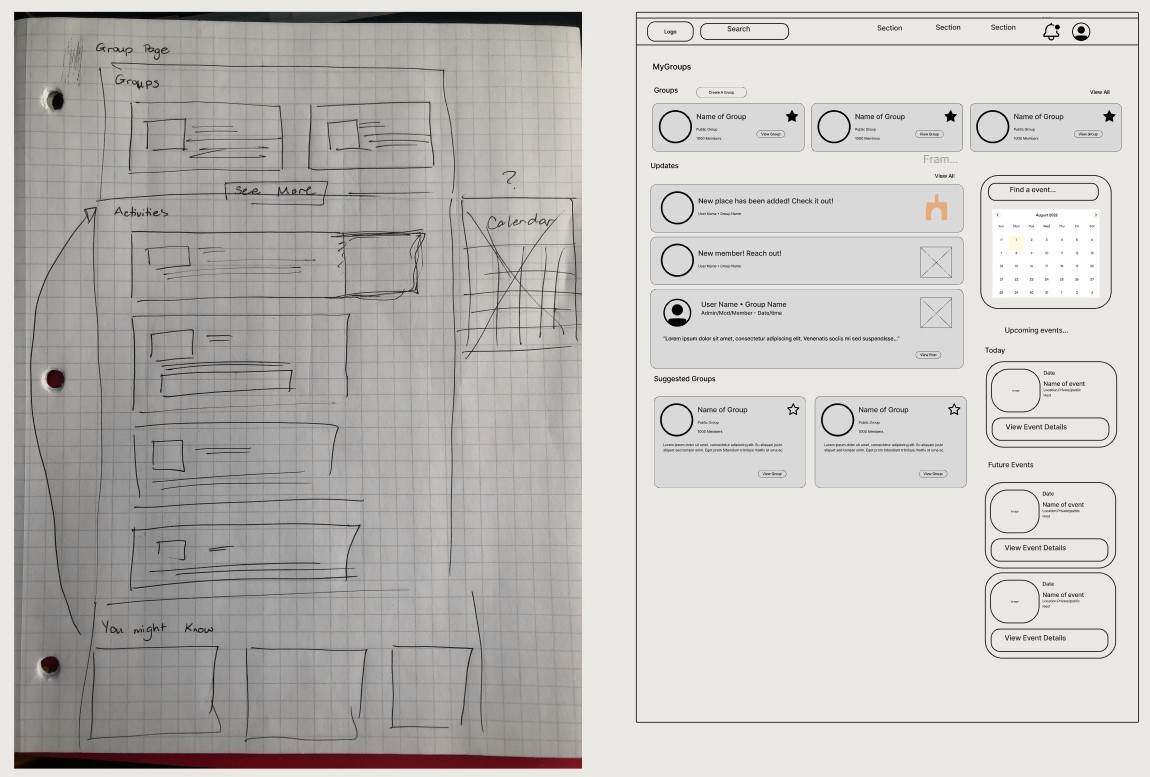
Rapid Prototyping
Having mapped an improved user flow I spent time rapidly prototyping a solution. Sketching helped me rapidly iterate on the original idea and visualize a solution without committing too early to high-fidelity screens. We also used mid-fidelity to be able to visualize and explain ideas better.
Styles
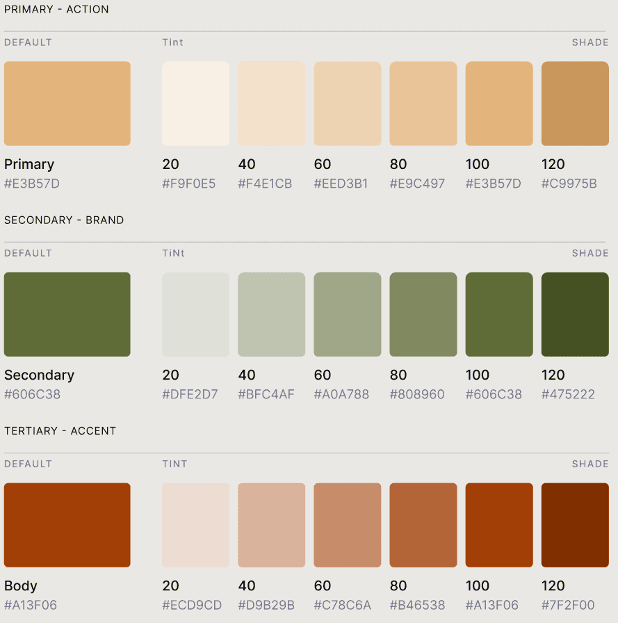
Before creating the hi-fidelity prototype we defined the style that we wanted to utilize. Since we weren't focusing on the brand, we chose the same color scheme, but chose a more vibrant variation.
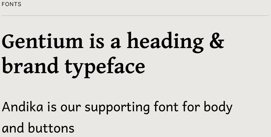
Since MyPlace is a global product, we wanted to be able to have a font that is internationally friendly. We went with Gentium and Andika for that reason as they were able to encompass the Latin, Cyrillic & Greek scripts; thus supporting the wide variations of alphabets.
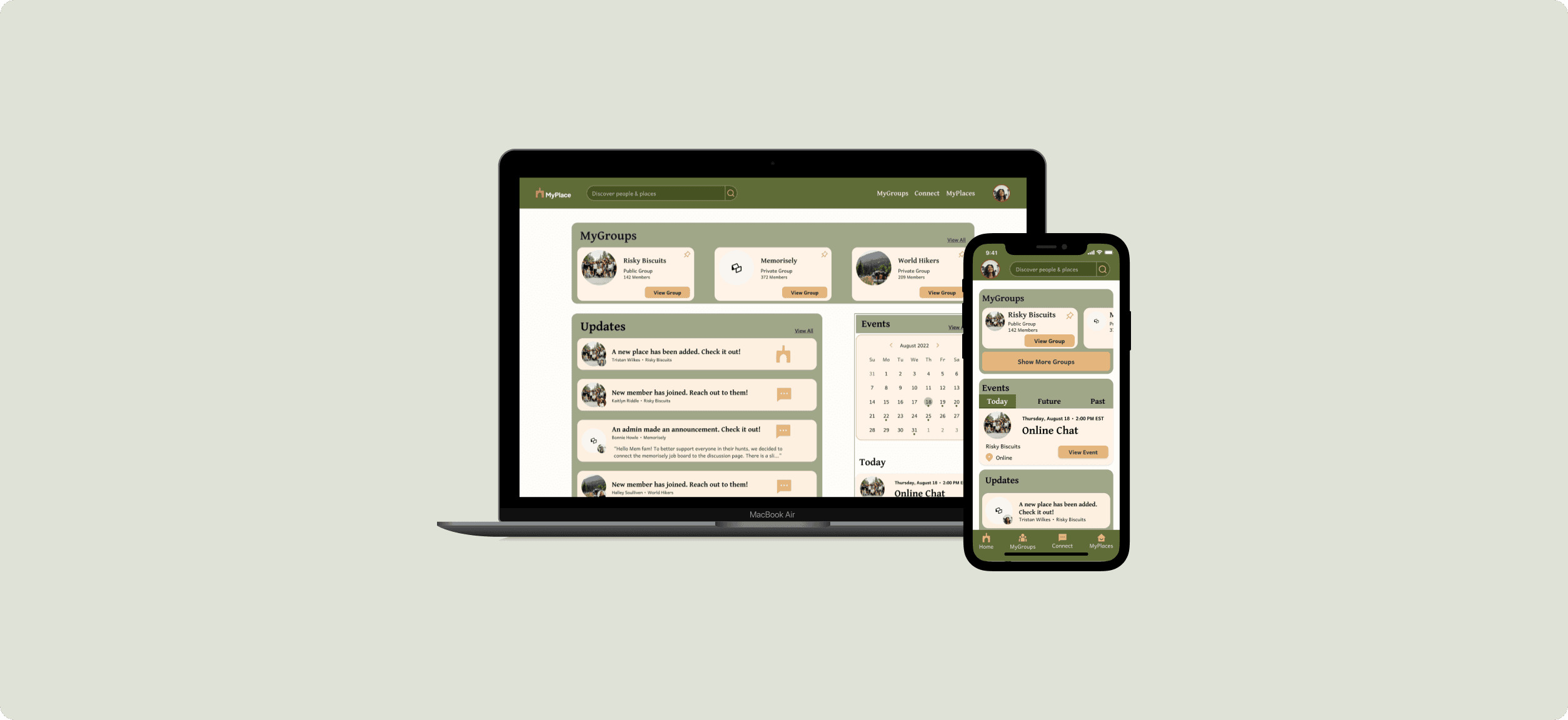
Groups Landing Page
We added a group landing page to allow users to have easy access to all the communities that they have joined. Here they can see the activities that are currently happening with the updates or will happen with the events section.
Tabs
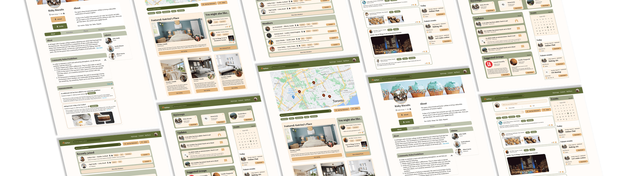
For the actual group’s page, we utilized tabs to better organize the content of the page. Originally, users will need to scroll through the entire page to find the information, which is not optimal or efficient.
Activities
An added content to allow users to discuss amongst each other about anything. This aims to get users to connect with each other and build stronger relations online.
Explore
We utilize MyPlace’s original map idea to allow users to explore different areas around the world and see which users reside where. There are also feature listings and discussions to help users with their exploration and ideation.
Members
The member's list is organized to help people talk to users that are new to the group and spark a conversation. There are also filters and tags to easily identify what the user’s personality and likes are.
Next steps
To take this case study further, there are still some next steps that I would take to ensure the design's usability. This includes usability testing and exploring other ideas such as profile pages and listings.
1. Usability testing will allow for comparative data and see if users can spark a connection together.
2. Profile pages are the final stop when connecting with another user; therefore, time should be allocated to research and design for this page.
3. Finally, while the problem was to improve the group's page, the explore page could be further improved given more focus on the listings.
Reflection
Given the short amount of time, it was crucial for our group to prioritize tasks and manage our time. However, we underestimated the amount of time it takes to do user research and interviews. We also lack the knowledge and understanding of MVP (Minimum Viable Product), having spent time discussing and researching features that were outside the project's scope. Next time, time should be focused on understanding the scope of the project to help better establish goals and manage ideas.