Role
UX Design
Wireframing
UI Design
Interaction Design
Usability Testing
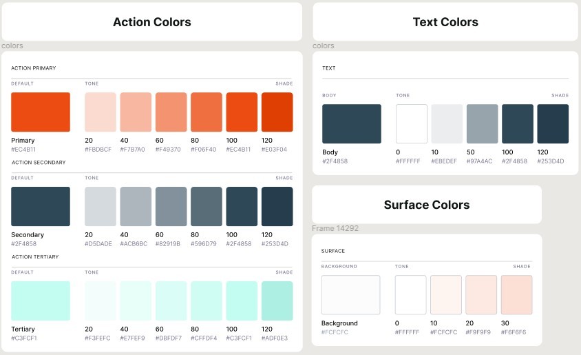
Tools
Figjam
Notion
Maze
Figma
Timeline
5 Weeks
Team
2 Designers
The Problem
Challenge flow lacked personalization to a new user which hinders their decision making. Customization and control was also absent as there were minimal challenge settings and functionality.
The Solution
Our team's solution involves making the challenge more discoverable and the process more intuitive, allowing for customization and easy sharability.
Research
Usability Review
To help me better understand the product, my partner and I conducted a usability review to identify pain points and wow moments in the existing experience
Business & User frustrations
Following a usability review, I defined the primary and secondary business and user frustrations.
Too much information!
When opening up the homepage for the first time, new users are introduced with a variety of options that a user might not fully understand where it will lead to which results in lack of predictability and frustrations leading to users not being able to complete a challenge.
Was my progress saved?
When completing the first day of the challenge users are led back to the same homepage with no changes which results in the possibility of users forgetting about their progress and having to go through the entire task flow in order to get back to the progress bar.
Why can't I do this?
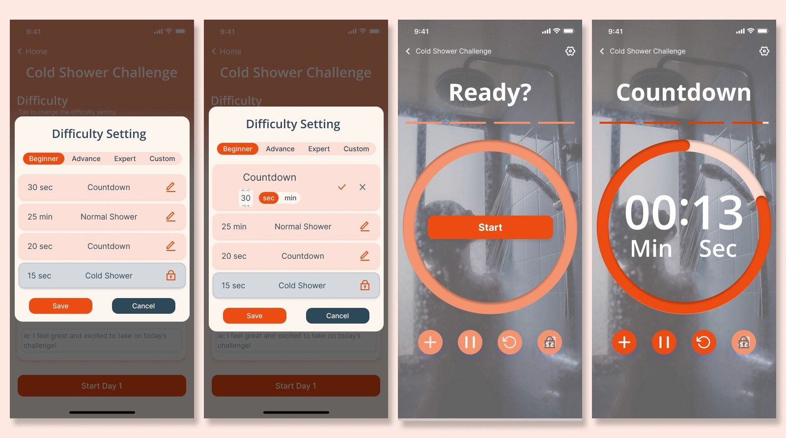
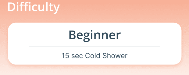
Going through the challenge settings, there are ways to customize the challenge difficulty to your liking; however, the options are very limited.
Competitor Benchmarking
With a usability review complete, we moved on to competitor benchmarking to help us identify standards in competitor products that could be used to improve the existing experience. We analyzed 2 direct competitors, Cold Shower Therapy and Cold Water Therapy; and an indirect competitor, Habit Tracking.
What We Found
Customization
Users have a variety of customization when creating their challenge/habit
Progress Tracking
Users are able to see the progress of a challenge/habit in the home screen
Timer Functions
The countdown timer has numerous functions such as pause, music, etc.
Problem Space
With all these obtained information we can establish an how might we statement.
How might we make it easier for new users to complete their first cold water challenge?
Ideation
After establishing the problem space, we did a mind mapping to see what things can be improved on or added to. We narrowed down these ideas using Effort vs Impact, to understand what ideas would generate the most effort to our users needs while minimizing the amount of effort our teams exerts.
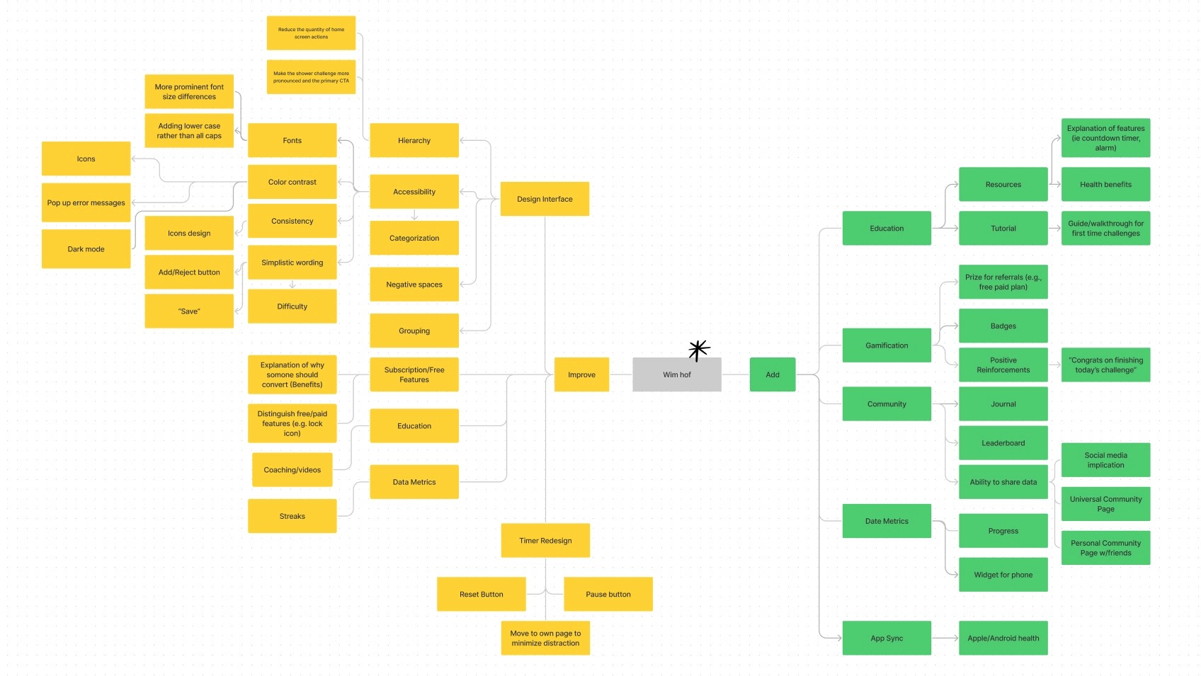
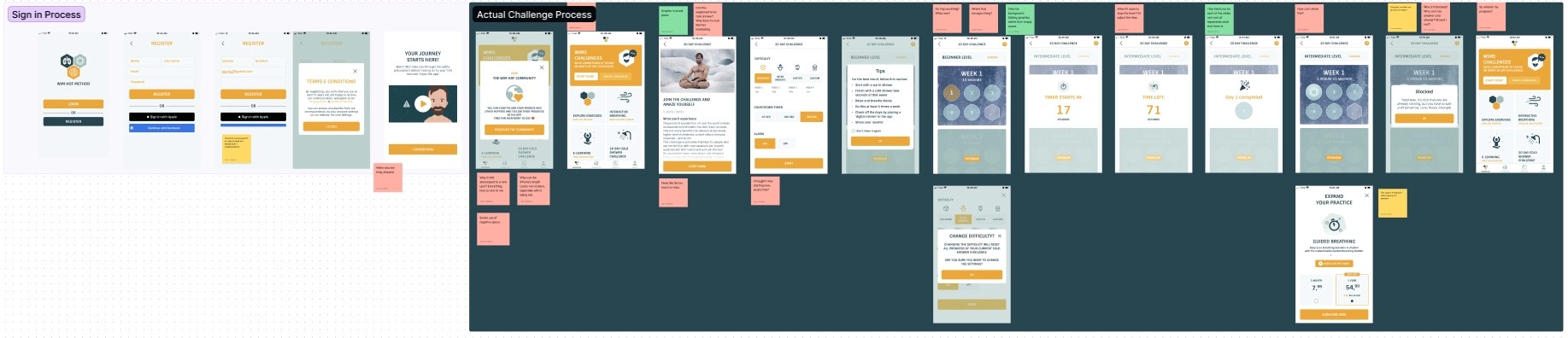
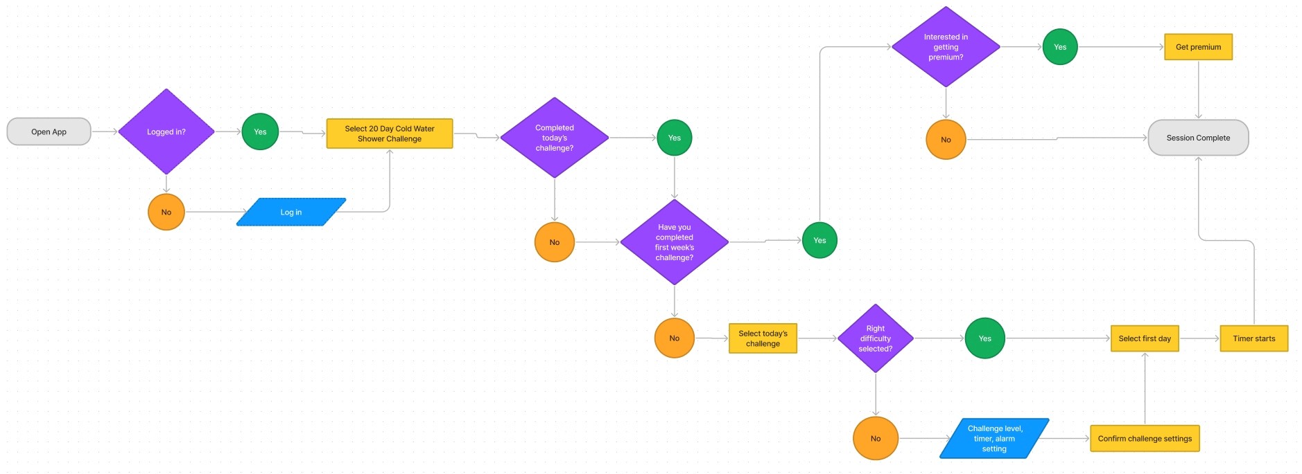
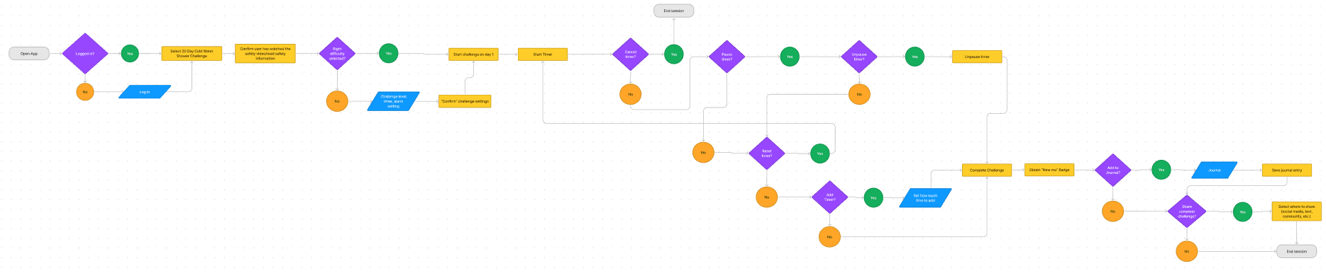
User Flows
Following Ideation, I created user flows of the existing experience and improved the flow based on the idea that fit with business and user goals.
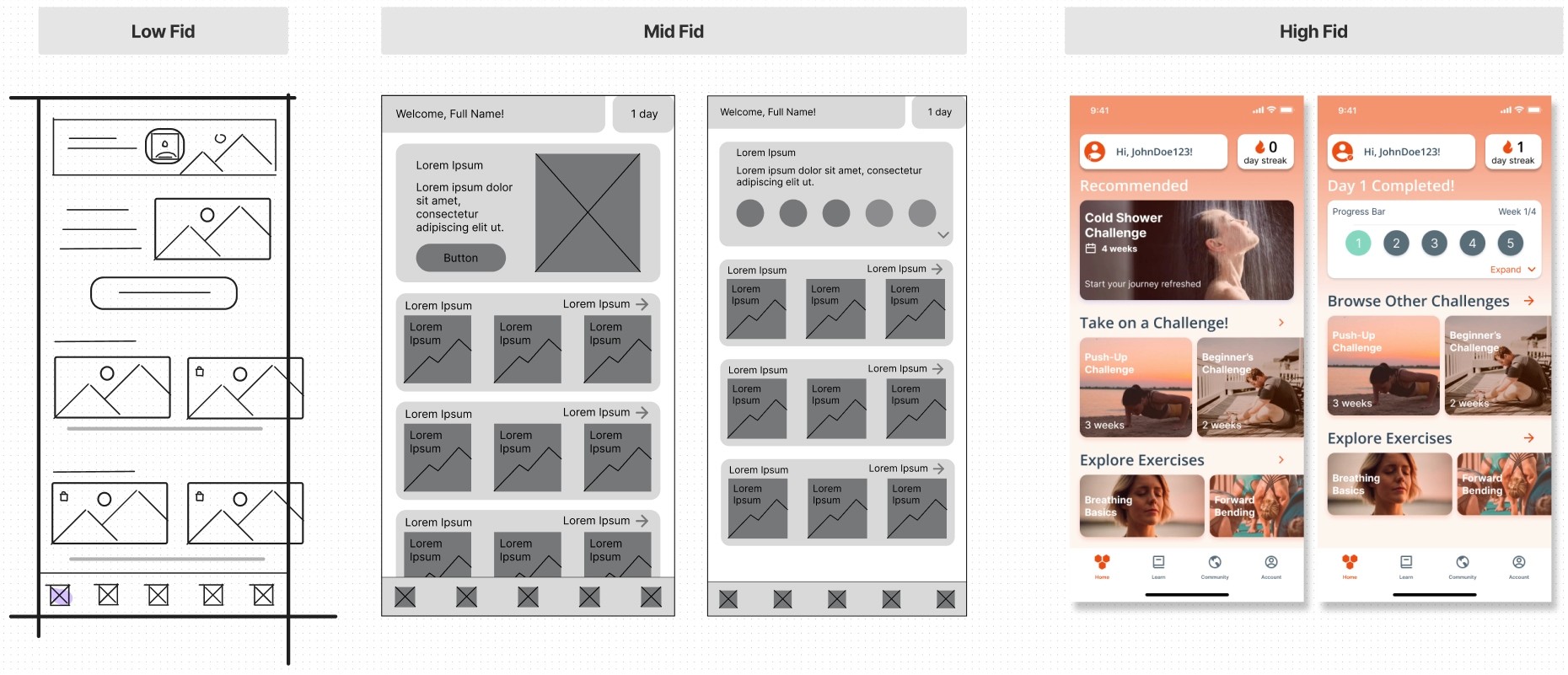
Rapid Prototyping
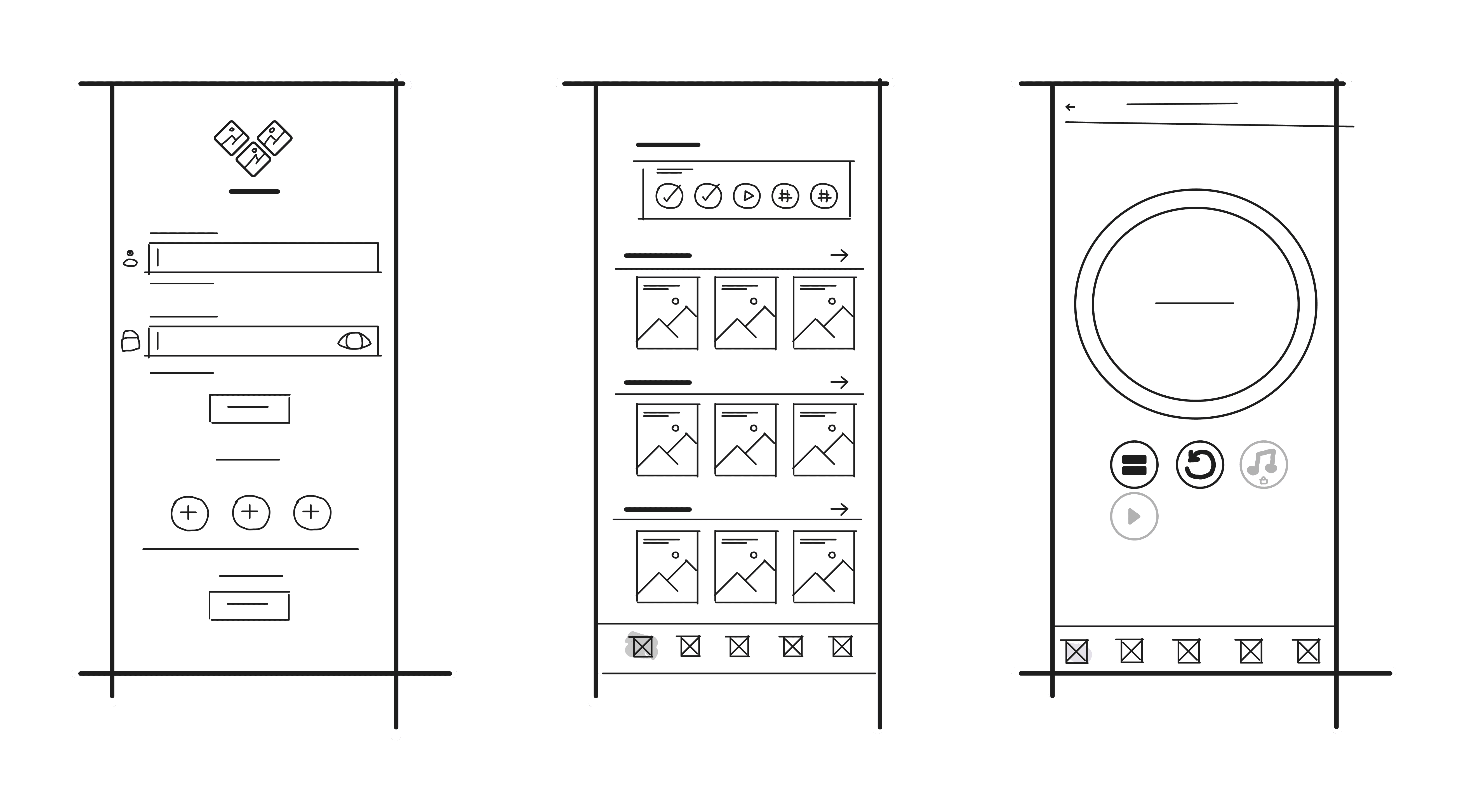
Having mapped an improved user flow I spent time rapidly prototyping a solution. Sketching helped me rapidly iterate on the original idea and visualize a solution without committing too early to high-fidelity screens. Below are some examples of our low-fidelity.
Branding
Color was also changed to make the app feel more vibrant and energetic, hence the orange red.
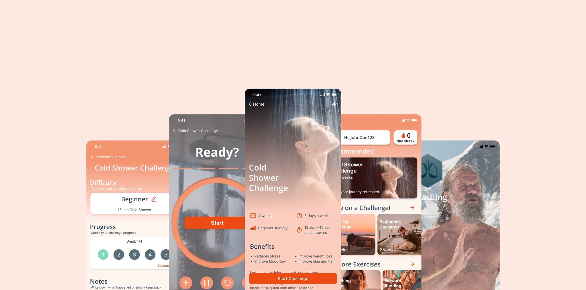
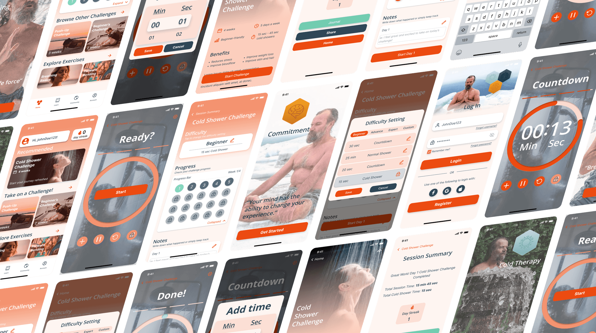
Low to High Fidelity
Below is an example of how I took our low fid wire frame and took it through mid-fidelity, and ultimately high-fidelity and bring a functional prototype.
Solution
The final design not only improve the usability of the app, specifically the cold shower challenge, but it helps give users a better experience. Going back to the reoccurring themes of organization, reassurance, and control, this is what we did to improve them.
Organization
We used better heirarchy and grouping to assist in the decision making process on the home screen. Icons and bullet points were used to enchance accessibility and absorption of information.
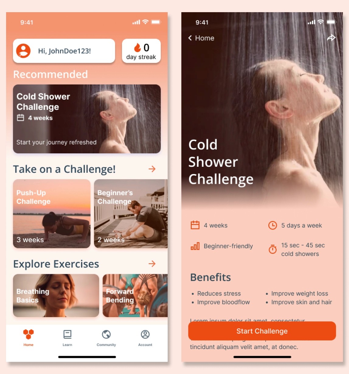
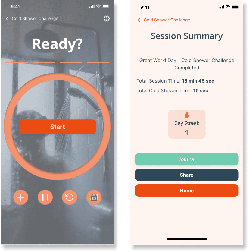
Reassurance
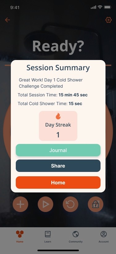
Usage of dialogue messages to confirm decisions and reassure users that their decision was saved. Additionally, a progress bar is created to help users see the progress of the current challenge on the home page so they can jump back in if needed.
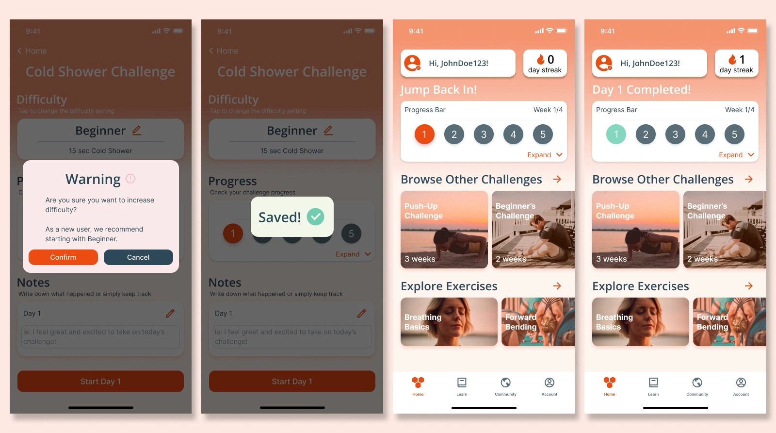
Control
Addition of scroll timers to help users get more precise with their settings to suit their situation. More features on the timer are also added such as pause or reset, to allow for more control.
Usability Testing
After the high-fidelity was completed, we then prototyped it and created a Maze test to see its usability. These were the two main findings that required redesign.
Challenge Setting Discoverability
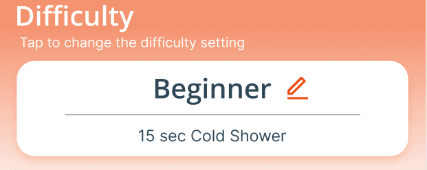
Using heat maps and time, users were found to have a difficult time looking for the button that would change the challenge settings.
Before
lacked discoverability
lacked affordance
After
more accessible
more discoverable and intuitive
Summary Page Focus
When users were tasked to go back home, they clicked outside the overlay to go home using the bottom navigation. We then removed the bottom navigation to allow users to focus on the timer and session summary when necessary.
Before
lacked focus
After
easier to focus
less distractions
Learnings
To push the prototype further, I would explore…
1. A function to bring a friend along to keep both users accountable.
2. A community page for sharing progress, advice, and more competitive purposes.
3. Results page where users can track their completed challenges/activities.
Reflection
Even though we got positive feedback from our usability testing, I think it would have been nice to have an initial usability test to compare too to see if we actually had improved the design.
User interviews of the targeted audience would have also helped establish what metrics motivate them the most or what they like to journal.